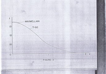
Figure 1. Scanned hand-drawn plot in a 1970s thesis located in NIP Library.
Here I am, writing a blog for my class. I don't why I have to do this but I have to do this blog right now. I am done in duplicating the graph I have. The image above is the one I have gotten from a thesis from 1970. The picture below is the graph I have attempted in duplicating the picture above.
As you can see, the plot I have created with the red-colored line almost coincide with the graph that I have chosen. I have not duplicated the entire plot due to it's rotation that I have done with the help of James Christopher Pang and GIMP. :)
It was difficult to do the approximations using only the PAINT program. It has features that was not there in order to rotate the image because the plot is not straight and so the pixel of a straight vertical line varies. After rotating the graph, it looks like a good graph already and so I superimpose the rotated image and the plot that I have and poof, the lines almost coincide.
I am happy with what I have done. I am sure I have done a good job in doing the activity. So I guess, I will rate myself with 4 for the Technical Corrections because the figure I have has still some corrections and it's not exactly the same, 4 for Quality of Presentation because it has few errors in the figure, 2 for the Initiatives because I have used another software in order to have a more accurate figure to duplicate.
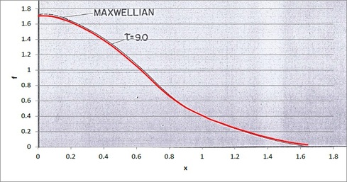
Figure 2. Duplicated plot with the red line as the duplicate line and the sample is the dark line.